King Arthur
King arthur is a seriously talented musician and DJ. I created a brand book to ground King arthur’s look and feel across mediums. In addition, i’ve created some lyrical videos for him as well as social posts and posters.
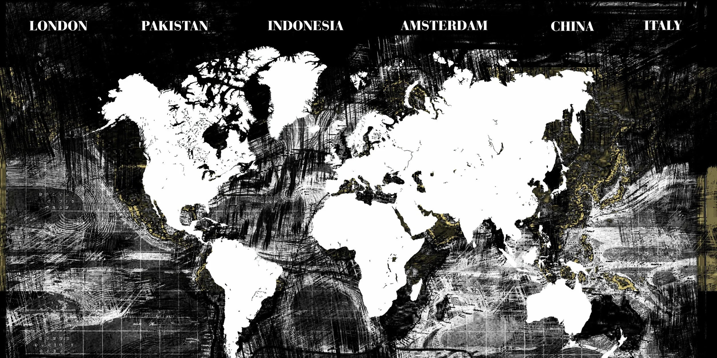
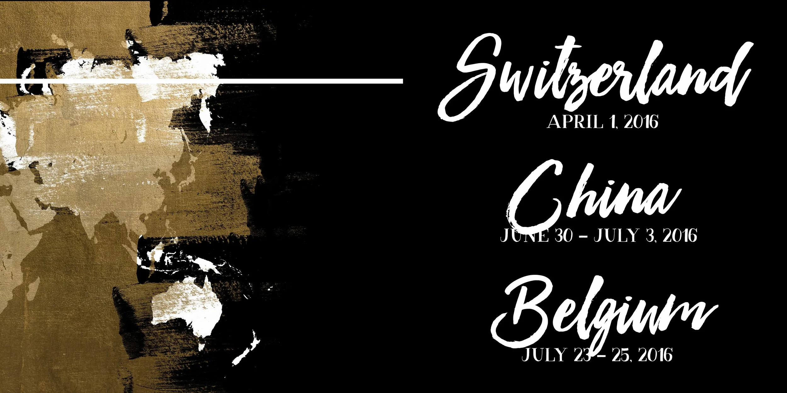
When Topher came to me, he asked if i listened to EDM music, when i regretfully said no, his response was simply “great, so i won’t look like them.” That became my manifesto in creating KA’s brand look and feel. Utilizing his existing elements of the crown logo and a couple posters, I wanted to develop a voice that was gritty, real, almost ancient. I have a tendency towards dichotomies in design, so for Topher, I wanted to combine the ancient loyalty embedded in King Arthur of Camelot with the fresh grittiness of his more modern music styling. With that came attributes of gold leaf, stone castles and a medieval font face which an edge.
The Circle: it was a concept obviously borrowed from the knights of the round table and felt corny at first but finally stuck because of this ideal of his fans being his “closest, inner circle,” it fit so seamlessly that it felt amiss not to integrate it.


